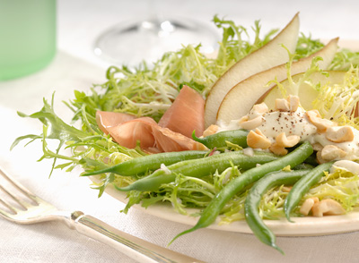
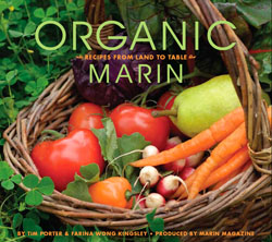
 My new book – Organic Marin, Recipes from Land to Table – punctuates a lengthy transition from newspaper journalist to photographer and (still) writer. The passage has been at times unsettling, exhilarating and frightening in ways I never foresaw.
The journey continues. The photography challenges me technically, artistically and financially, but it represents what I set out do as a younger man and I remain compelled to pursue it. I write less, but what words I do put down are more honest.
How this book came to be might, I think, interest anyone who finds himself at one of life’s many crossroads forced to choose a direction, perhaps one less familiar than the well-trod path that brought him there.
As we age, the road ahead shortens and opportunities for change lessen. I am fortunate. Change has come to me often, though not often easily. This latest new direction, though, was the hardest. My job became my identity. I defined my worth through professional success. When one day it was gone, I drifted, uncertain how to value myself. Then, through the goodness of family and friends I found my way forward by reaching into my past. There, still aflame, was the passion of youth, waiting to be put to use.
A few years ago when I wrote a lot about newspapers, I often referenced a book written by Stanford professor Bill Damon, Good Work, When Excellence and Ethics Meet. It explored the differences between professions in which most workers were fulfilled (such as biotechnology) and those in which most workers were not (such as journalism). Damon summed up the personal pursuit of ethical work (good work) with this line:
When faced with a difficult decision, when considering if a line is worth crossing, ask this question: “What would it be like to live in a world if everyone were to behave in the way that I have?”
I had loved my job, but it was not the “good work” I wanted – and apparently needed.
From the Newsroom to the Blogosphere
 One of the most innovative thinkers about modern journalism, NYU professor and blogger Jay Rosen, did me the honor of praising the writing I had been doing on my former blog, First Draft, about how poorly newspapers were responding to the digital media revolution.
The roots of First Draft were in part cathartic, exploring why I became a journalist and why I eventually left its institutions behind; they were also conditional – in my early 50s I was out of work after the bust of the Internet Boom. I had plenty of skills, but was unsure where or how to apply them. Newspapers remained an option, but a desire to write, to photograph, to fill empty spaces with self-expression that existed long before I ever became a “news executive” was a creative itch that ached to be scratched.
Through a friend I became involved in a three-year newsroom innovation and learning project. I dumped what I learned from that work into First Draft, and much of what I discovered was contrary to the way I had practiced journalism and managed people for two decades. Rosen called me “a man humbled by a lack of knowledge who decides to go out and get some.” He described me this way:
“He approaches this task with a certain intensity, and even anger, because it is revealing of his own career— in fact his own illusions. With Porter, the education is coming after the experience.”
His characterization was correct: I was intense, I was angry and, perhaps mostly, I was disillusioned by a profession I loved, but one I also believed had let me down in a way I couldn’t articulate at the time. This cauldron of emotion, made frothier by interviews I’d done with hundreds of working journalists, resulted in The Mood of the Newsroom, the First Draft post that triggered Jay’s encomium.
I wrote about the nostalgia for the past and frustration about the future I had found in newsroom after newsroom, a combination that prevented individuals and institutions from embracing the changed needed to keep journalist alive in the digital age.
“Professional life,” I wrote, “isn’t turning out quite the way these journalists thought it would – and it makes them mad.” Of course, those words applied to me as well.
As it turned out, Mood of the Newsroom was an apogee. It triggered a self-realization that I no longer wanted a traditional journalism career, especially one that favored the past over the future. I continued the blog for another 18 months while I finished the project (and a book with my partner, Michele McClellan), but what followed was mostly denouement. Mentally, I had moved on.
The Rebirth of a Photographer
About the time I wrote The Mood of the Newsroom, my wife gave me a little digital camera. It was a life-changing gift.
I had studied photography in college, first in art classes and then in journalism school. My first post-college job was as a photojournalist on a small newspaper, where once the editors learned I could also write asked me, occasionally at first, but then regularly, to put together packages of photos and feature stories that could fill lots of weekend space.
The writing expanded, ambition took hold and I jumped into editing, where I stayed for nearly two decades.
Three years ago, a friend started a new magazine where I live, Marin County, just over the Golden Gate Bridge from San Francisco. Would I write for it, she asked. Only if I can take pictures, too, I replied.
That’s how it began. I bought a small Nikon DSLR and started shooting – quite badly. My technique was terrible, my vision was unformed and nerves in those first few months made it all worse.
Over time, through much trial and much more error, I improved. I learned to control the light, I learned how get the most from a digital file and I learned how to trust my visual instincts.
As I grew as a photographer, so did the magazine’s confidence in me. About 18 months ago, just as my friend, Lisa Shanower, the publisher, and I were talking about doing a book she met someone with publishing connections and soon we were mocking up a prototype.
The original idea was not a cookbook (and I’ll keep that idea under wraps for now), but we wanted the publisher to think we were serious so our proposal included the outline of a second book, one on organic food.
A few weeks later we got the good news from Andrews McMeel, the publisher: Love the book idea – the cookbook!
Lisa talked with a local chef, Farina Wong Kingsley, who became my partner in the project, and Andrews McMeel assigned a project manager and designer, Jenny Barry. All I had to do was learn to photograph food.
If you’ve read this far, I’ll reward you by skipping the details of the photo shoots. I’ll say only that the learning curve was steep and I would not have succeeded as well as I did without the help of numerous others.
Indeed, while Organic Marin was a fulfilling project on many levels, the joy of this long-term collaboration with others is what thrilled me most. Even though newspapers require immense amounts of teamwork to produce, they are hierarchical and driven by deadline, daily necessity and a demanding canon of tradition. Collaboration among peers is rare.
I have arrived now at a point, somewhat late in life, where people matter more than process, where curiosity and self-expression drive my actions and where, more commercially, I try to build a photography business that blends the best that journalism gave me with, as Jay Rosen might put it, my continuing education about a future still under construction.
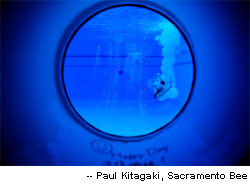
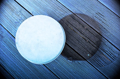 It’s been cold here in Marin — well, California cold, meaning below 40 at night. Yesterday, morning brought a crunchy layer of white frost over the deck, a coating, that with the cool-blue, pre-sunrise light, made for a nice picture.
 Last year was a tough year for journalism (and many other professions). Newspapers, a
  Organic Marin, Recipes from Land to Table, has gotten positive reviews from a couple of food bloggers.
 My new book –
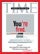
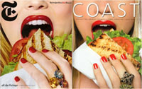 * Bite Me, I’m an Art Director: Hey, if you’re going to rip off someone else’s cover concept, why not steal from among the best — the New York Times’
  Each month for
  * Get Visual, Buy a Book: Here’s a good list of
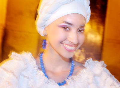
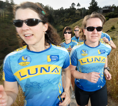 One of my great challenges in photography has been making new techniques work the first time out on the job. I haven’t always been successful at that, so if the job permits (meaning there’s enough time or the art director doesn’t have a specific shot in mind) I usually plan on a back-up shot as well, something I’m sure I can pull off.
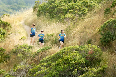
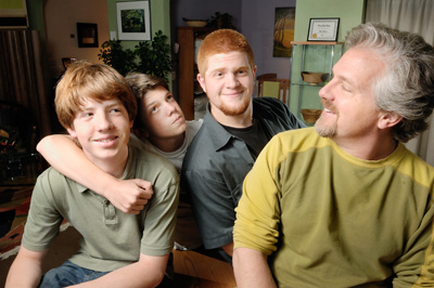 Just a quick post on this portrait because I am jamming to finish a couple of magazine projects before I head out of town for a working vacation — to the wedding of a friend in Cartagena. Vive los novios!
 * Expanding or Contracting? Jim McNay, in
 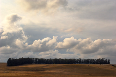 Some people say their love affair with photography came when they first picked up a camera. It didn’t happen that way with me. I had been idly making snapshots with my first 35mm camera — a Pentax — for months before I felt a moment of magic, and that happened not with my eye in a viewfinder, but with my hands in a tray of developer. I fell in love with the print.
 When I shot film, I came to live for the print because the print enabled me to see the image I’d made. Later, as I switched to digital I realized I didn’t need the print to experience the excitement of the image. There it was, on the computer, large and vibrant. I still enjoyed the “darkroom” work — enhancing contrast, extending tone, shaping color — but now the darkroom was dry and digital instead of damp and chemical, so I stopped printing.
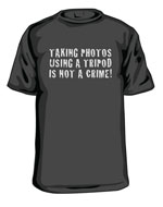 ging on basic civil liberties in others. Here are a few recent examples of America, home of the paranoid:
 * People Who Need People: The New York Times