When I first started making portraits of people, everything I shot was tightly framed. It was all about the face. I came in close and measured my success by the details I could see. The more pores the better as far as I was concerned.
Some shrink, I’m sure, could attribute my desire to fill the frame with face to some unaddressed childhood need or perhaps a lack of adult intimacy, but it probably had more to do with the Yousuf Karsh portraits I saw in school and my desire to replicate those (not that I ever did).
 Today, as much as the face still fascinates (and as much as I still want to focus on follicles), I’ve backed off. Now, I’m looking more for context than closeness. I want shape, posture and attitude more than detail.
Some of that change in approach came from maturing as a photographer, but much of it also comes from the assignments I have. Frequently, I find myself making a portrait of a person simply standing or sitting somewhere and I need to use the environment around him or her to create an image that is striking, or at least has some snap. Also, many art directors want openness (or negative space) in the frame so they have the option to overlay type in that area.
Because I rarely have any control over the location or the timing of the shot, which means I’m often having to make something interesting under either muddy skies or full sun, I’ve become attached to using a single strobe to isolate the person from the background.
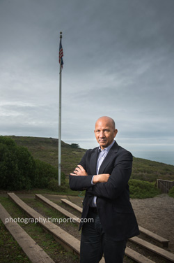
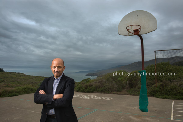
These images of Chuck Collins, CEO of the YMCA of San Francisco, illustrate what I mean. Marin Magazine asked me to photograph Chuck and I met him on a moist, gray December morning at the YMCA’s facility in the Marin Headlands.
I arrived early and looked over the place. It was bleak. Empty buildings. No kids. Windswept grounds. The vacant basketball court had appeal, though, as did a small empty amphitheatre with low, wooden seats. Both had strong vertical structures (the hoop and the flagpole) I could use.
Chuck helped, too. A good-looking easy-going guy, he gave me enough time to adjust the light several times and even helped me lug the battery pack from the basketball court to the amphitheatre.
I liked the results, which you can see in the images on this page (bigger versions below). The magazine, as it often does, chose a different frame, but that’s why they pay me – to give them choices.
You can see more of my photographs of interesting people at photography.timporter.com or here.
There is no gallery selected or the gallery was deleted.


Hi Tim!
I love your blog. It is amazing how much interesting content you have on here.
May I ask what kind of strobe you used on this portrait? So far I have only been using Canon Speedlights, but I am currently looking at the Profoto B1 and the Phottix Indra 500 TTL to achieve a look like this. Do you ever use speedlights on location or do you always go with a stronger strobe?
Thanks a lot!
Ben
Thanks for the nice words, Ben. Yes, I use Nikon speedlights frequently, both in my magazine and documentary work. I use a Profoto 7B pack outdoors when I need more than fill and have the capacity to lug it around.